Recognisable visual language
Type, colour, layout and motion work together so the company feels consistent before the logo is even noticed.
Brand systems for companies that need to look distinct without turning every touchpoint into a design experiment. Identity, type, colour, voice and reusable rules built to survive daily use.
Build what's next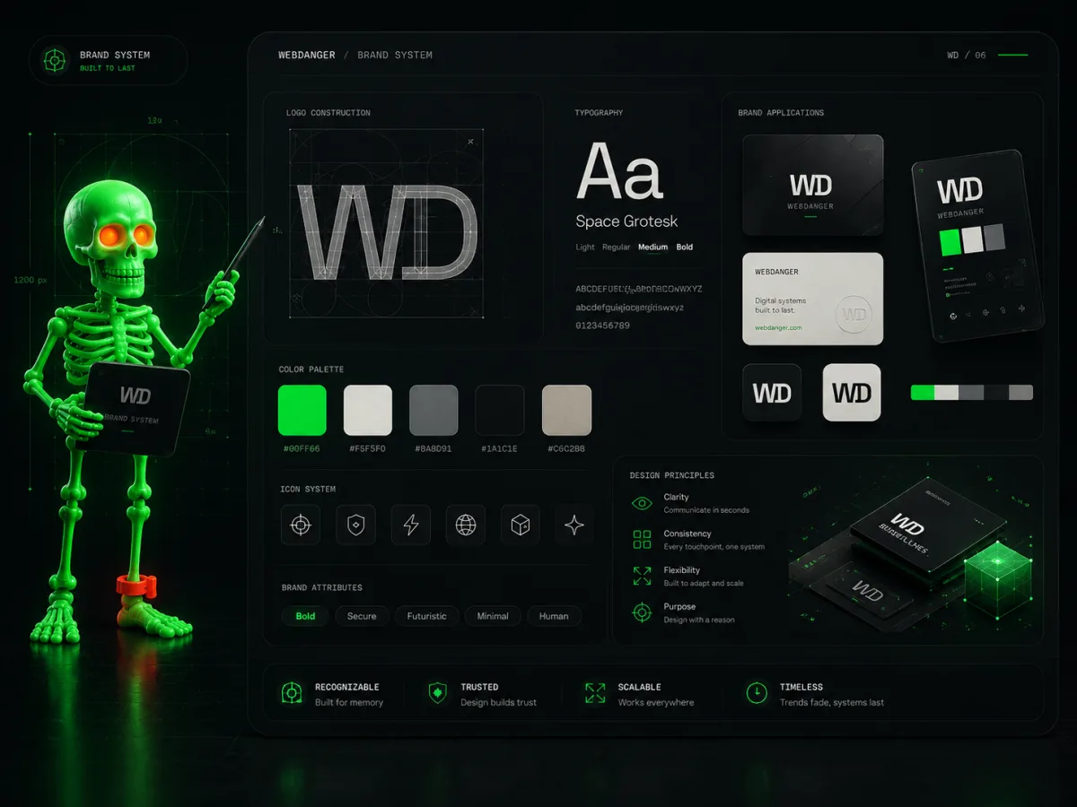
We design enough structure to create recognition across web, product and sales material—without producing a 180-page guideline nobody opens after launch.
Type, colour, layout and motion work together so the company feels consistent before the logo is even noticed.
Headlines, microcopy and messaging rules give the brand a voice beyond “innovative solutions for a changing world”.
Templates and tokens make everyday publishing faster without lowering the bar every time a new asset is needed.
We identify what should feel unmistakably yours before choosing shapes, colours or clever typography.
Identity elements are tested across real pages, product states and business materials—not only a dramatic mockup wall.
Rules, files and templates are packaged so the team can create consistently without summoning the original designer.
We take identity seriously. We just do not require a three-hour workshop to name the colour green.
Not always. Sometimes the best move is to keep recognition and repair typography, hierarchy, voice and digital execution.
Yes. The output includes practical digital rules and reusable assets, not just presentation images.
Tell us what is stuck, expensive, slow or strategically important. We will turn the rough version into a concrete delivery path—with scope, ownership and the next decision visible.
hello@webdanger.com