Sharper offer hierarchy
Visitors can see what is being offered, who it is for and why it is credible before the page runs out of attention.
Conversion optimisation for websites, funnels and commerce paths where the next revenue move hides in the details: the offer, proof, page hierarchy, form, checkout and measurement.
Build what's next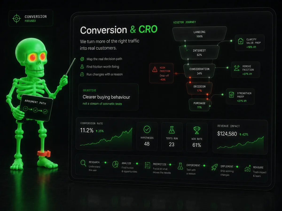
We study the actual decision path, find the friction worth fixing and run changes with a reason. The objective is clearer buying behaviour—not an endless queue of cosmetic tests.
Visitors can see what is being offered, who it is for and why it is credible before the page runs out of attention.
Forms, checkout, navigation, pricing and proof are tuned around the questions that quietly prevent a next step.
Changes are measured and documented so the next test begins with what the business learned—not last month’s mood board.
We inspect landing pages, events, recordings, forms and checkout states to identify where attention or confidence breaks.
Changes are ranked by expected commercial impact, confidence and effort instead of treating every visual observation as a test.
Winning changes become part of the product system; weak ideas leave with enough evidence to avoid a sequel.
The fastest route to a lower conversion rate is changing five things and learning nothing.
No. We can start with qualitative evidence, clear usability problems and high-value path analysis; test design follows the volume available.
Yes. We can improve the current surface, tracking and decision flow before recommending a rebuild when the evidence does not support one.
Tell us what is stuck, expensive, slow or strategically important. We will turn the rough version into a concrete delivery path—with scope, ownership and the next decision visible.
hello@webdanger.com