Faster activation
Onboarding is reduced to the minimum information and actions required to reach the first useful moment.
Mobile products designed around repeated behaviour, not a desktop interface squeezed into a smaller rectangle. Native-feeling flows, clear states and engineering decisions that survive release week.
Build what's next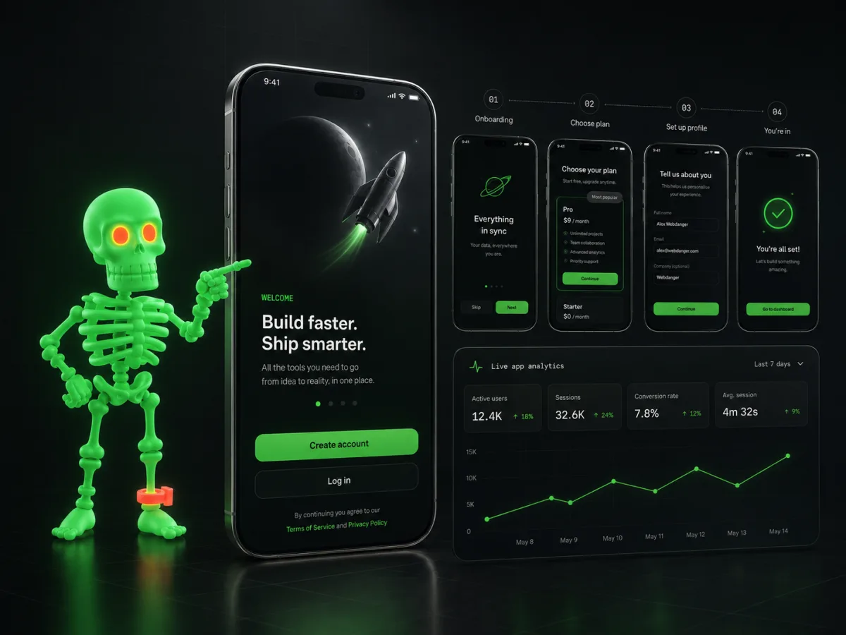
We prioritise the moments users repeat: onboarding, search, creation, payment, notifications and recovery. The rest has to earn its pixels.
Onboarding is reduced to the minimum information and actions required to reach the first useful moment.
Navigation, gestures, loading, empty states and errors follow a consistent product language.
Analytics, crash reporting, API behaviour and store readiness are designed into the product instead of discovered by reviewers.
We decide what a successful session looks like before designing twenty screens around it.
Important paths are tested with realistic states, not just beautiful happy-path screens.
Performance, permissions, offline states, analytics and store constraints are checked before the launch-day adrenaline arrives.
We like ambitious apps. We just prefer ambition with a usable navigation model.
We choose based on product behaviour, performance requirements, device integrations and team constraints—not ideology.
Yes. We assess the product model, keep what works and rebuild the interaction system around actual usage.
Tell us what is stuck, expensive, slow or strategically important. We will turn the rough version into a concrete delivery path—with scope, ownership and the next decision visible.
hello@webdanger.com